.png)
Dashboards - Create and edit dashboards
In the dashboard section, you can set up multiple personalized dashboards, allowing you to choose the information included. This way, you can create different dashboards tailored to specific use cases. For example, one dashboard might be designed for regional managers, while another is suited for store managers. In the dashboards, you can combine data from several touchpoints, with each widget added to the dashboard allowing you to select the relevant data.
NOTE
Only administrators can create and edit dashboards. They also control which teams have access to specific dashboards through the access and permissions settings.
IN THIS ARTICLE
- How to access dashboards in the platform
- Create a new dashboard
- Manage dashboards
- Export dashboard as pdf
- Export widgets as images
- Arrange dashboards
- Duplicate dashboards
- Search a dashboard
- Schedule a dashboard as a report
- Export Data
- General filter on dashboards (paid module)
1. How to access dashboards in the platform
Option 1:
From the home screen of your Hello Customer account, click on the Dashboard icon next to the touchpoint name

Option 2:
Step 1: On the home page of your Hello Customer account, click Dashboards on the left side:

Step 2: Choose the right touchpoint:

2. Create a new dashboard
There are a few steps when creating a dashboard
Step 1: Open the dashboard creator:
When you don't have any dashboard with data for that touchpoint yet:

- When there is at least one dashboard built already, there are two options:
By clicking the three dots on the right:

Next to the already created dashboard(s):


Step 2: Choose the name of your new dashboard. Make sure to choose a short name which makes immediately clear what this dashboard is about
Step 3: Choose the type of dashboard you want to create. There are two types:
- Default: The default dashboard includes a predefined set of widgets, which are automatically populated with data from the touchpoint where you started creating the dashboard. Of course, you can customize the configuration of these widgets, remove them, and/or add new ones.
- Custom: If you want to build a dashboard from scratch, it's best to start with an empty custom dashboard.
Once the dashboard is created, it is time to fill it with the information you need. Therefore, you can add as many widgets to your dashboard as you want.
Step 1: Open the edit mode of your dashboard:
- In case you created a new dashboard, it opens automatically in edit mode
In an existing dashboard, you can click the three dots on the right and choose "Edit":


In edit mode, a list with all available widgets appears.
Step 2: Add any widgets you want by clicking on the tile of your chosen widget in the available widget list. See available widgets for a comprehensive overview.
Step 3: Configure your widgets as you like:
Resize them by using the arrow in the lower right corner

- Give them a proper title
- Configure your widget: select the data to include (from which touchpoint, for what date range, etc.), apply filters, and customize settings as needed.

2a. Available widgets
Since a dashboard can include information from multiple touchpoints, all widget types are always available to add. However, once you configure a widget, only the relevant touchpoints will be available as data sources. For example, if you add a widget related to NPS, you can only select touchpoints that contain an NPS question as a data source.
i. Metric widgets
Metric widgets are all widgets related to NPS, CES and CSAT. For every metric, there's a score summary, repartition and evolution widget available. It's also possible to add a team ranking based on the metric score.
- The score summary widget displays a summary of the selected metric, with its appearance varying based on the specific metric.
NPS

CES

CSAT

In the repartition widget, you can see the percentage of people who gave a specific score on the metric question. This is available for all metric questions, and here’s an example using NPS.

With the evolution widget, you can track how your score changes over time. You can choose to view this evolution on a daily, weekly, or monthly basis. The dots on the line represent the score calculated at the end of the selected interval. For the weekly interval, for example, this would be on a Sunday. Hovering your mouse over the dots will show you the score and the date of the calculation.

- There are two lines in the graph:
- Daily/Weekly/Monthly average: The average score for the submitted responses within that day/week/month.
- Moving average: the average of the scores from the first day of the selected date range up until the day/week/month represented by the dot.
- In the example above:
- Monthly average of September 2023
- average of all people who answered the survey in "September 2023" = between 1/9/2023 - 30/9/2023
- NPS = -26.79 with 56 people answering the survey
- Moving average of September 2023
- Average of all people who answered the survey since the first date of the selected date range, in this case 20/2/2023, until the last day of September 2023 = 30/9/2023
- NPS = -40.97, with 454 people answering the survey.
- Monthly average of September 2023
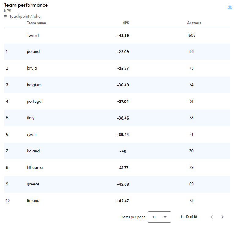
The team ranking widget displays a ranking of all the teams a user is allowed to view, along with their scores for the selected metric. You can also see the number of responses and the number of participants (for email touchpoints) the survey was sent to. Learn more about teams.


IMPORTANT
To properly configure the Team Ranking Widget, you must follow these steps in this exact order:
- Select the type of metric
- Select the data source
- Select any other parameters (filters, timeframes...)
Selecting the data source first will prevent the widget from being configured correctly.
ii. Score widgets
The score widgets are similar to the metric widgets and are specifically for 0-10 and 1-5 score questions. For both types of questions, a repartition and evolution graph are available.
In the repartition widget, you can see the percentage of people who gave a specific score on the metric question. There's also an average score included.

With the evolution widget, you can track how your score changes over time. You can choose to view this evolution on a daily, weekly, or monthly basis. The dots on the line represent the score calculated at the end of the selected interval.

- There are two lines in the graph:
- Daily/Weekly/Monthly average: The average score for the submitted responses within that day/week/month.
- Moving average: the average of the scores from the first day of the selected date range up until the day/week/month represented by the dot.
- In the example above:
- Weekly average of week 23 Dec 2024
- average of all people who answered the survey in "week 23 Dec 2024" = between 23/12/2024 - 29/12/2024
- Average = 5.33 with 61 people answering the survey
- Moving average of week 23 Dec 2024
- Average of all people who answered the survey since the first date of the selected date range, in this case 20/2/2023, until the last day of "week 23 Dec 2024" = 29/12/2024
- Average = 5.05 with 997 people answering the survey
- Weekly average of week 23 Dec 2024
- There are two lines in the graph:


iii. Other questions
To show the results on yes-no questions and multiple choice questions, there are two widgets available.
The yes-no results widgets displays the results of one or more yes-no questions. The available options are always "yes" and "no".

The multiple choice displays the results of one or more single or multiple-choice questions. When results from multiple questions are shown together, the corresponding options are grouped together. If the answer options of different questions do not match, they are displayed separately. All possible answer options are shown in the widget, even if no one has selected a particular option yet.


iv. Feedback
First, there are two widgets related to response rates. Please note that for email touchpoints, all numbers in these widgets are displayed based on the date the invitation email was sent. This means that if an email was sent on 1/11/2024, and the recipient answered the survey on 2/11/2024, their response will still be shown under 1/11/2024. This approach makes it easier to track response rates for different batches of surveys.
The general response rate widget is only relevant for email touchpoints, as it displays:

- The total number of participants to whom an email was delivered
- The number of completed surveys (based on the first question)
- The number of people who unsubscribed
In the text response rate widget, you can see how many participants provided open-text feedback compared to the total number of people who gave a score on the first question.


In addition, there are two other widgets directly related to the feedback participants provided:
The Feedback Widget displays open-text feedback from participants directly on your dashboard. You can choose how many responses to display and filter them by a specific ISAAC topic or a particular score.

The Conversation Status Widget is linked to the status of surveys in the conversations section of the platform. This allows you to easily track how many conversations still require your attention.


v. Categories and sentiments
The widgets related to categories and sentiments display the results of the text analysis (ISAAC) for open-ended responses related to specific metrics. You can choose which metric's text analysis you want to display.
All ISAAC-related widgets are clickable. This means that clicking on a graph opens a side panel where you can view all raw feedback related to the selected category, sentiment, or other criteria.
Mentions per main category: Provides an overview of the most frequently mentioned main categories in the feedback. It does not distinguish between positive and negative feedback but highlights the topics most important to your customers.

Sentiment spread chart: Breaks down the sentiment behind the feedback, showing whether responses for this touchpoint are mostly (very) positive, (very) negative, or unknown.

Top 10 positive/negative categories: Displays the categories that contribute the most to both positive and negative feedback, giving you immediate insight into what customers are happy or unhappy about.

Sentiment by category chart: Shows how people feel about various categories, providing a comprehensive overview of detailed categories mentioned in feedback and their associated sentiments.

ISAAC evolution graph: Allows you to track how a specific ISAAC category path or group evolves over time. After adding the graph, make sure to edit it immediately to select the desired category path or group—otherwise, no data will be displayed.


vi. Advanced widgets
In the Data table you can customize what is shown in the rows and what is shown in the columns for one or several periods. It is possible to combine data for different touchpoints and questions within this table.
- Row options:
- Answers to questions:
- Multiple choice questions
- Yes/no questions
- Metadata keys (coming soon!)
- Answers to questions:
- Column options:
- Metric score
- Metric groups
- Sentiment spread
- Totals

2b. Configuring widgets
This section handles the configuration of all widgets, except the data table.
When you add a new widget, you may initially notice that no data is displayed. This is because you first need to select the data you want to display in that specific widget.
Additionally, you can configure other settings within the widget, such as:
- Filtering data for a specific customer group based on metadata
- Filtering responses based on a specific answer to a question
i. Data source
First, choose the data source for the widget:
- Choose the touchpoints from which you want to display data. Only touchpoints with relevant data will be available. For example, if you're configuring a widget related to NPS, you can only select touchpoints that contain an NPS question.
- Specify the question(s) included in the widget
- For yes/no, multiple-choice, 1–5, and 0–10 questions, you must specify which question(s) to include in the widget.
- You can combine multiple questions of the same type.
- For multiple-choice questions, all possible answers from the selected questions will be displayed. If different questions have overlapping answer options, those options will be shown together. Unique options will be listed individually, even if no one has selected them yet.
- If the widget is related to text analysis, you need to select the metric for which the analysis should be shown. Afterward, you can choose the relevant touchpoints. You can also choose whether the text analysis needs to be displayed for all people or only for a certain metric group (e.g. "detractors" in case of NPS).

You can choose whether to display touchpoint names and/or questions within the widget. If the toggles are activated, the touchpoint names and questions are shown below the widget title.

If your dashboard contains at least one widget with multiple data sources, the dashboard will be available in all touchpoints configured as data sources. This means that the same dashboard may appear multiple times within your environment.
ii. Widget settings
In the widget settings, you can specify a date range for which the widget should display data. Keep in mind that if you set a specific date range, the widget will function independently from the date picker at the top of the platform.

Additionally, some widgets have specific configuration options. For example, in the feedback widget, you can define how many open-text feedback entries to display.
iii. Question filters
With question filters, you can exclude data linked to participants who provided a specific answer to a particular question. For example, you can filter out everyone who gave a 1–2 on the CSAT question (unsatisfied).

Note: Question filters can only be activated if the widget has a single touchpoint as its data source.
Question filters are displayed as a chip at the bottom of the widget. However, you can choose to hide the question filters if you prefer not to display them.

iv. Metadata filters
Lastly, you can filter the data based on specific metadata values. This allows you to create a widget for a particular customer group, such as women aged 25–34.

Metadata filters are displayed as a chip at the bottom of the widget. However, you can choose to hide the metadata filters if you prefer not to display them.

If your dashboard contains widgets filtered by a specific metadata key, and that key is later configured as a team filter, you may encounter an error.
What does this mean for you?
If you add a metadata key as a team filter after data has been collected or modify an existing team filter, any widgets using that key as a filter may stop working properly and fail to display data.
How to resolve this:
To fix this, you will need to update the affected widget filters to align with the new team filter configuration.
By keeping this in mind, you can ensure your dashboards remain accurate and functional even after changes the team filter.
2c. Adding permissions
Once your widgets are configured, it’s time to set up the permissions. There are two ways to configure permissions for a dashboard:
- From the dashboard's edit mode
- Via the teams overview in settings
i. From the dashboard's edit mode
Step 1: Open the dashboard edit mode via the dashboard menu

Step 2: Click the blue button in the upper right corner to open the dashboard permissions screen:

Step 3: In the dashboard permissions screen, you can decide which teams are allowed to view the dashboard. All teams linked to the touchpoints selected as data sources in at least one of the widgets on the dashboard will be displayed.

ii. Via the teams overview in settings
Step 1: Go to Settings > Identity Management > Teams. The team structure will load, and next to each team, you'll see a permissions icon and a dashboards icon. These icons allow you to set up the team’s permissions and specify which dashboards they can access.

Step 2: Click the dashboard icon. A side panel will open, displaying an overview of all the dashboards linked to this team structure. Dashboards with data from multiple touchpoints will appear at the top, followed by the touchpoint-specific dashboards.
Step 3: Select which dashboards the team is allowed to view and save your changes. From this point on, members of the team will have access to the dashboards you specified.

3. Manage dashboards
3a. Export dashboard as pdf
You can download your dashboard as a pdf file. This file can be used to send it to other people inside or outside your organization.
Step 1: Trigger the export as pdf menu

Step 2: There are two parts in the menu:
- Quick preview: this shows you all the widgets of the dashboard including the title of the dashboard and the selected date range
- Print layout: in the print layout you can see how the pdf will exactly look like. In this view, you can see where the pages are cut off.
You can do some small changes in both views, for example: collapsing or expanding the amount of categories you see in the category explorer or changing the amount of rows you see in the team performance widget. Please note that the print layout will only update if you did any changes after you switched between quick preview and print layout.

Step 3: Push export button to trigger the export of pdf. The file will directly download in your browser.
3b. Export widgets as images
You can export your dashboard widgets as images. This can be done by clicking the export icon in the upper right corner of the widget. A .png image will immediately start downloading.

3c. Arrange dashboards
You can choose the order of your dashboards. When clicking on Arrange dashboards, a pop-up will open with where you can drag and drop your different dashboards and put them in the order that you prefer. The order of the dashboards is specific per touchpoint.

3d. Duplicate dashboards
It is possible to duplicate a dashboard. Once duplicated, the new dashboard will have all the same widgets and filters as the original one. Of course you can adapt this afterwards to your liking. The duplicate functionality can also be found in the menu triggered by the three dots on the right:

3e. Search a dashboard
When you have a lot of dashboards, it can be difficult to scroll to the correct one. Therefore, you can also search for a specific dashboard.

3f. Schedule a dashboard as a report
You can send a dashboard to certain recipients on a regular basis as a report. Learn how to do this here.
3g. Export Data
You can export the data used to build the widgets as a csv file. With this option you can select to download the answers used on the different widgets and also the ISAAC categories. This raw data can be used to build your own dashboards and perform your own analysis outside our platform.
IMPORTANT
Currently you can't download data from cross-touchpoint dashboards
Step 1: Select "Export Data"

Step 2: A pop up appears where you can select :
- Language of the headers on the export
- What data you want to export:
- Answers
- ISAAC

Step 3: Once selected, click export and a csv file (or two, if you select both Answers and ISAAC) will be downloaded, containing the raw data.
IMPORTANT
Only the data from conversations with open-text feedback for the main metric question will appear on the exported file.
4. General filter on dashboards
The general filter on dashboards is a paid module. If you want to know more about it, contact your customer success manager or mail to support@hellocustomer.com
With a general filter, you can filter your whole dashboard on the go, like in analysis. With the general filter, you can filter all your dashboard widgets at the same time.

Please note that filters on widgets take precedence over the global filter on the dashboard. That is, the fixed filter on a widget for certain metadata takes precedence over a global filter for the same metadata. So, for example, if you have a widget with a filter collection = fall, this widget will still show that data, even when the general filter is collection = winter.