.png)
Analysis - Extra questions
Next to the main metric questions, we have some other question types that can be added to a survey and of which the results are shown in analysis:
- Yes-or-no questions
- Multiple choice questions
- 0-10 questions
- 1-5 questions
In this article, you'll see learn how the results of these questions are visualized in analysis.
NOTE
You can also add a custom question in your survey. Since the answers on a custom question can be anything, they are only visible in conversations, not in analysis.
IN THIS ARTICLE
1. How to get there
The results of the extra questions can be found in the analysis part of the platform.
Option 1:
Click on the analysis icon of the touchpoint of your choice

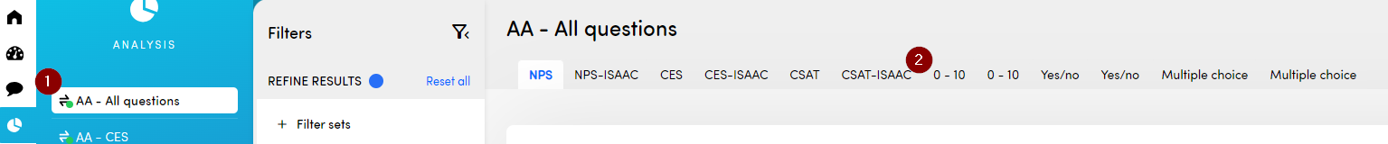
You are automatically redirected to the analysis of the first metric question of your touchpoint. To go to the analysis of your extra question, choose the correct tab.
Option 2:
Step 1: Click on analysis in the left navigation menu

Step 2: Choose the correct touchpoint and go to the tab of the extra question you want to analyze
2. Interpreting the numbers
2a. Yes-or-no questions
A yes-or-no question is a question on which respondents can only choose between two answers: yes or no. In analysis, this is visualized as a bar chart with both the exact number of responses of respondents who chose yes or no between brackets and a percentage.

The specific question that was asked and the total respondents that gave an answer to this question are shown at the top of the page.
2b. Multiple choice questions
A multiple-choice question is handy when you want to ask something of your respondents and more than one answer can be applicable. Each answer option is shown on the analysis page with the number of times the option was chosen and a percentage in which the option is compared to the total number of answers.

Since respondents can choose more than one option, the total number of answers shown at the top of the page can exceed the number of individual respondents.
WARNING
When modifying the wording of multiple-choice question answers, it's important to note that only the most recent version is considered in the filters within the Conversations and on the Analysis section.
While it's possible to revert to a previous wording, responses that don't match the current wording won't appear when filtering conversations or be included in the analysis.
To maintain consistent and accurate data analysis, it's advisable to finalize your answer options before distributing your survey.
2c. 0-10 questions
The 0-10 question is mostly used to rate something specific. In analysis, there are three widgets for this question:
At the top of the page you can see how many people answered this question and an average score of all answers.

The repartition shows how many people gave an individual score (0-10) on the question.

With the evolution, you can follow up how the score on your 0-10 question evolves in time. You can choose whether you want to see this evolution on a daily, weekly or monthly basis. The dots on the line represent the score that is calculated at the end of the chosen interval. For the weekly interval, for example, this is on a Sunday. You can hover your mouse over the dots to see the score and the date of the calculation.

There are two lines in the graph:
- Daily / weekly / monthly average: the average of the scores submitted that day / week /month
- Moving average: the average of the entire selected timeframe since start until the day / week / month the dot represents


2d. 1-5 questions
Another option to rate something specific is the 1-5 question. In analysis, the widgets are the same as for the 0-10 question:
At the top of the page you can see how many people answered this question and an average score of all answers.

The repartition shows how many people gave an individual score (1-5) on the question.

With the evolution, you can follow up how the score on your 1-5 question evolves in time. You can choose whether you want to see this evolution on a daily, weekly or monthly basis. The dots on the line represent the score that is calculated at the end of the chosen interval. For the weekly interval, for example, this is on a Sunday. You can hover your mouse over the dots to see the score and the date of the calculation.

There are two lines in the graph:
- Daily / weekly / monthly average: the average of the scores submitted that day / week /month
- Moving average: the average of the entire selected timeframe since start until the day / week / month the dot represents


3. Results of extra questions for specific customer groups
Filtering on participant attributes (metadata) can be very beneficial in determining how certain customer segments answered your extra questions. Comparing different groups to one another can also be interesting which is why we added smart filtering to the platform to simplify this process. To learn everything about smart filtering and comparing groups, read this article.